How are facepiles used to represent presence on the web? A review.
ℹ️ This is one of a series of notes from my summer 2023 invention residency with PartyKit. See all research notes here.
A facepile is a common way to show realtime presence on a webpage. They usually appear as a horizontal row of image avatars, representing users... but they vary in functionality. This research note catalogues various types.
Last updated: 6 November 2023
A list of interactions
A list of user avatars can show the history of interactions with a unit of content, e.g. a post or photo. These examples are older (2014).
Note: this method might update in realtime, but it doesn't show presence and it’s not interactive. The facepile is attached to a content block, not a page.
Source: IndieWeb wiki

Facebook shows interactions under posts
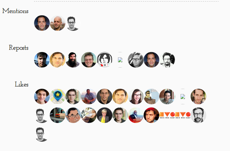
The facepile under blog posts can be lengthy.
Anonymous users
Google Docs shows anonymous users too (sign-in isn’t required. Tapping on an avatar doesn’t bring up any additional functionality (hovering shows their name). At larger numbers the avatars collapse into circles that show “+2” or simple “3”.
Additionally: The facepile is grouped with the current user’s avatar, which opens site-wide settings; a share button (to invite more users); and buttons that open comment/edit history. There is also per-document chat.
Source: 9to5Google
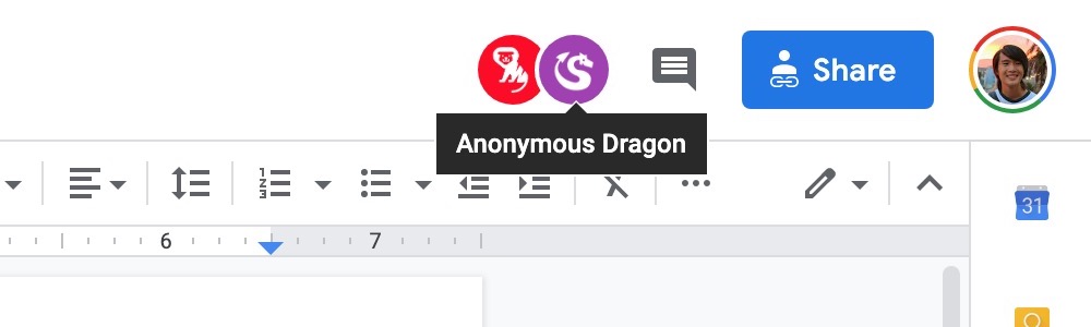
Anonymous users, signed-in users, and the current users are all shown, together with sharing and collaboration history actions.
As a person-picker
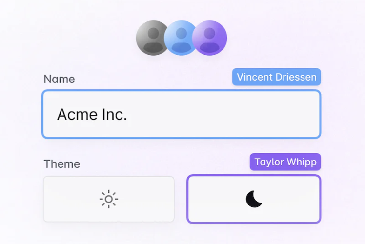
Microsoft uses facepiles in its Office UI. The previous-generation Fabric JS web framework includes a component to be used when giving access to a file or assigning a user to a task. Tapping the user opens a contact card. Realtime presence is shown as a badge.
The more recent framework is Fluent UI. The official Facepile component optionally shows live presence as a small badge, and recommends an inline "Add" button. The avatars (called personas by Microsoft) should show a tooltip or be clickable to show a card.
Sources: Fabric FacePile component; Facepile control built on top of the Fluent component.

The facepile is used as a person-picker.
Realtime presence is a badge.
Realtime collaboration badges
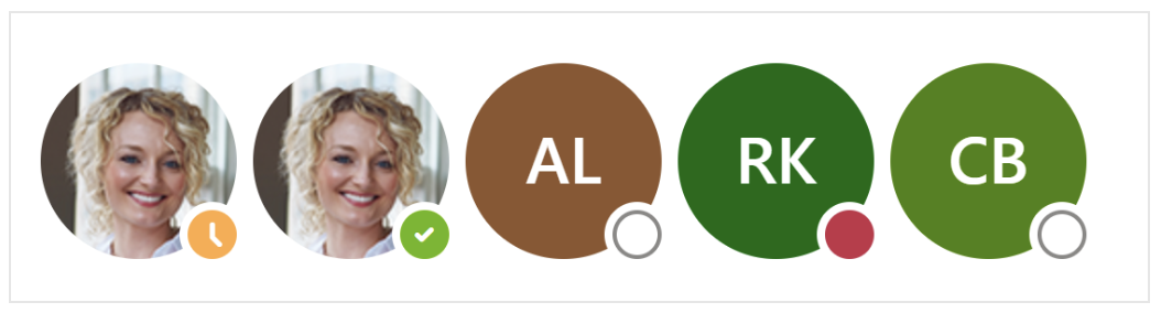
Notion shows facepiles in two places: within a page, the avatar bar appears in the top right. Avatars represent realtime presence (ghosted avatars are “recently” present). It is also referred to as “view history.” In conversation: A max of 5 avatars in the display, but up to ~30 users are recorded in the view history (in the screenshot above, you can hover over the "+4" to see the full list).
The current user is included in this same list.
User presence is also shown outside a page as mini-avatars next to a block that links to a page.
Source: Notion
Presence is shown both within pages and from outside pages.
Functional facepiles
Tap on an avatar in Figjam to follow them. You see their edits, and both their avatars and the edit area are outlined with the same colour. Reminiscent of Reeves and Nass in The Media Equation where coloured borders were used to team up a user and a computer?
Audio calls can be started in Figjam. The avatar bar then groups the users who are chatting. Other uses can tap on the call to join it.
Sources: Figjam (following), Figjam (cursor chat), and Figjam (audio calls)
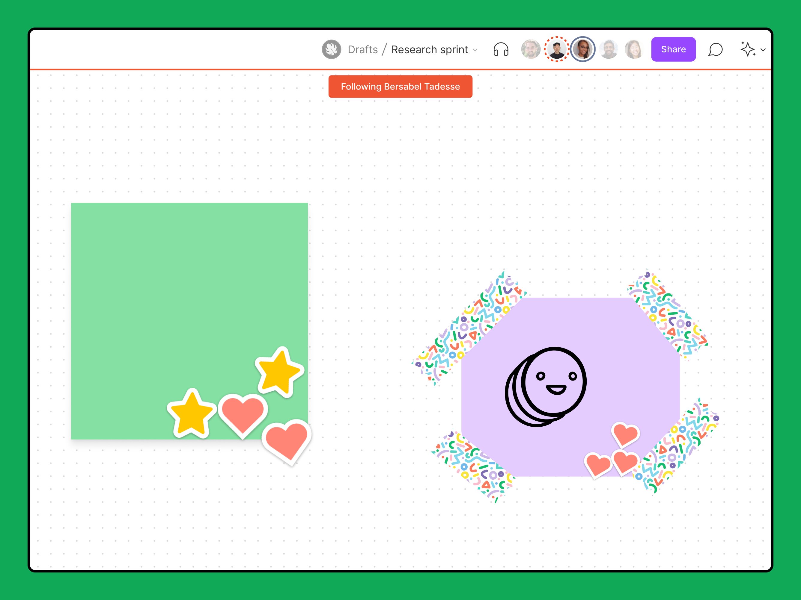
The ‘follow’ functionality has a visual language to connect the avatar and the screen.
Realtime short text messages hang from cursors, giving an additional sense of presence.
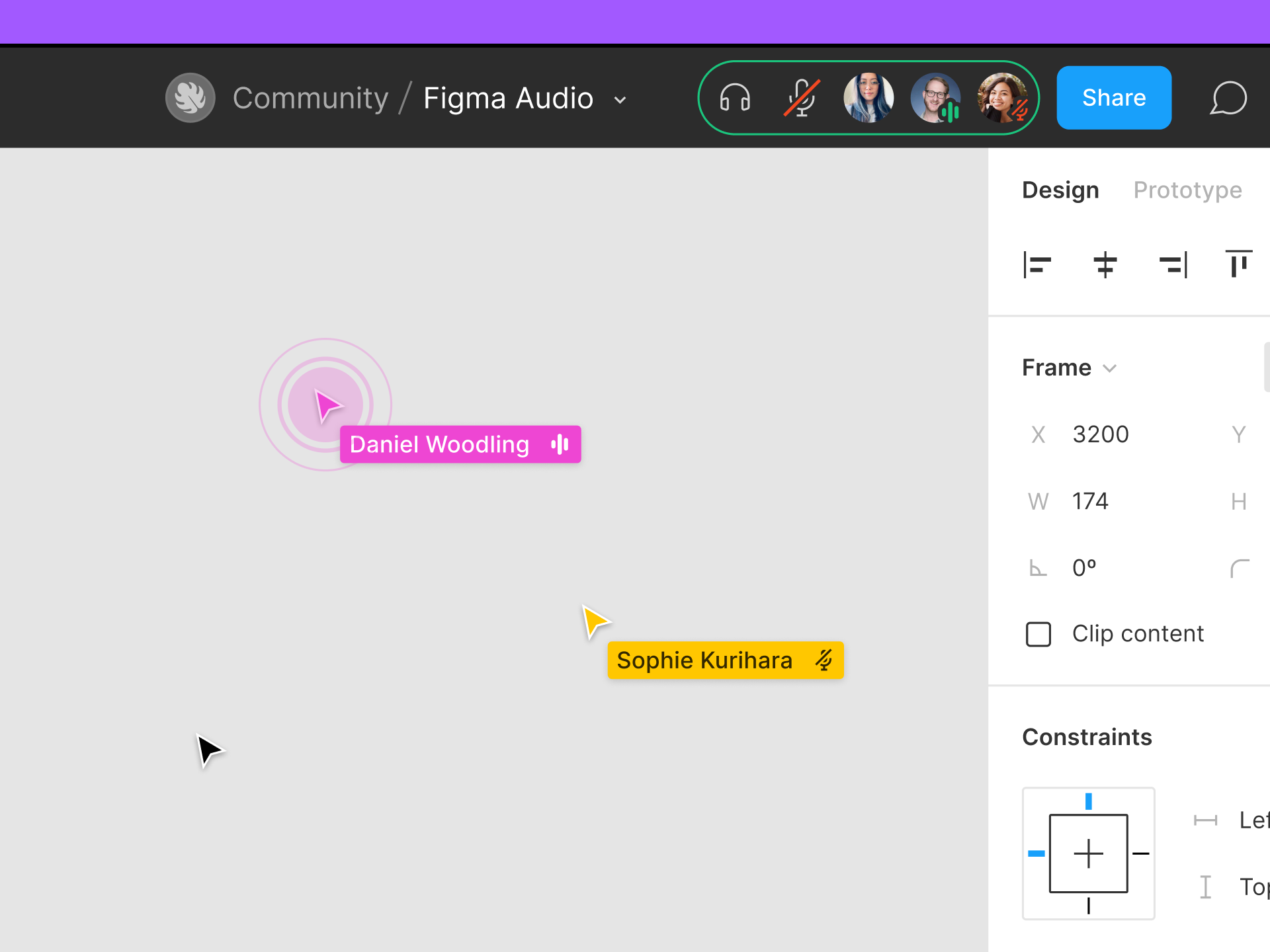
Note that audio calls can be in subgroups too. The calls are shown alongside the rest of the users present in the document.

X/Twitter Spaces also groups overlapping avatars in its call to action.
What are the defaults?
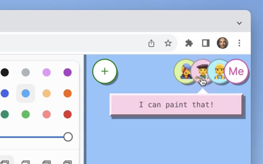
Both Ably and Liveblocks have platforms that enable realtime presence and collaboration, and provide example code to create “avatar stacks”. These are flexible so no particular design is mandatory. But they represent the modern trope: circular avatars, often overlapped, directly representing presence (so no extra badge is required). The presence context is the current page (called a room).
Sources: Ably and Liveblocks
Ably’s illustration of an avatar stack shows overlapping avatars.
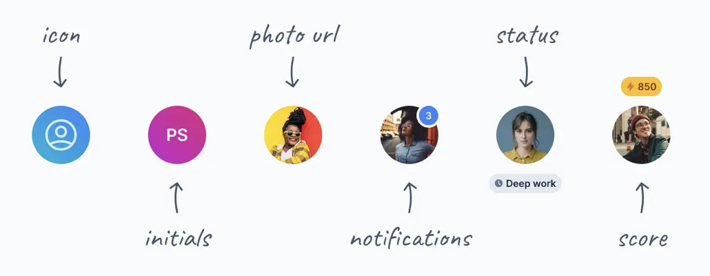
Decorations include status and notifications (for the current user).
Liveblocks (in its illustrations) connects the avatar colour to multiplayer carets and input field selections.
Rooms are a key primitive
Clubhouse had rooms, like document-based apps have “rooms”. (Clubhouse was an audio-first realtime social media app.) From outside a room, the avatars show smaller, next to the content block that they are inside. Within the room, avatars are listed in a grid, and broken into sections.
Source: Screenlane
Smaller, unbadged avatars are used to show presence on the other side of the hyperlink.
Not shown: there are multiple sections for different levels of presence in the conversation.
AIs and real users together
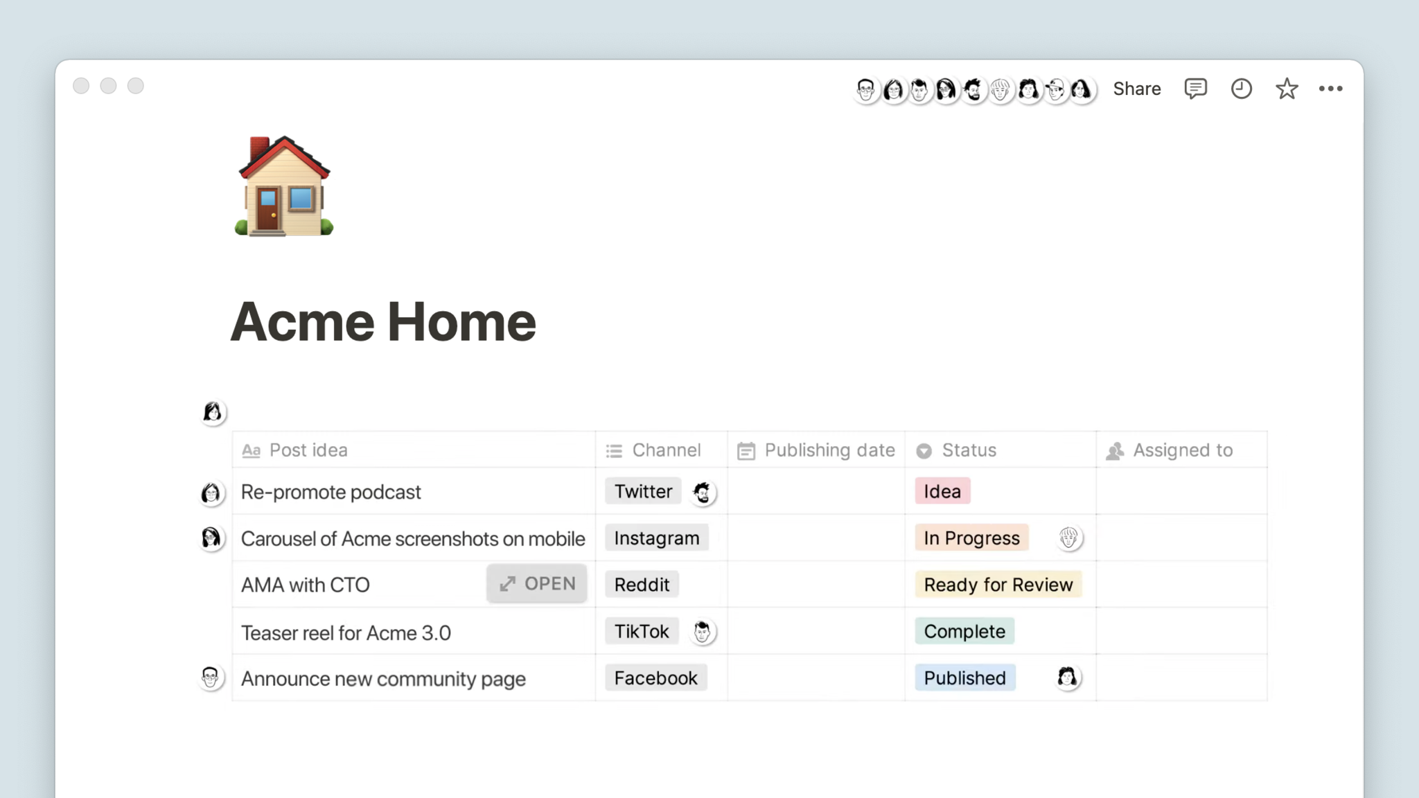
Should the facepile include agents? Agents are non-human AI users. This experiment mixes AI avatars with individual functionality into the list of human users.
Source: PartyKit
The AI avatar has context-dependent functionality in a popover.
Wishlist
It would be neat to have a standard set of components with all the functionality...
A main facepile in the top-right of the page that allows for...
- Overlapping avatars, and a separate avatar in the top right for the current user
- Separated subgroups for e.g. audio calls
- Popover cards and menus
- When functionality such as follow or live edited is used, visual halos to connect the avatar to other UI elements.
- Ghosted avatars to show recently present users
- Anonymous avatars
Additionally, there would also be smaller non-functional facepiles elsewhere on the page:
- Non-functional, display only
- Showing realtime presence on the other side of a hyperlink
A user avatar is an icon
Looking at the history of icons from Xerox PARC, an icon is an object in a metaphoric world that you can do things with in the real world.
It is not merely an illustration, it is a stand-in for the actual thing.
So if a user avatar is an icon, then how should a facepile behave?